Clear space
Keep a margin of empty space around the logo, with no text, graphics or edges inside it. More space is always better.
Resources
The official TradeMark Africa logo and graphics standards manual can be downloaded from the blue buttons below. The graphics standards manual is a practical set of guidelines to help you translate the TradeMark Africa (TMA) focus and values into communications that help our audiences understand what we do.
Logo suite Logo usage Colours Typography Donor & partner logos Brand manual Photography
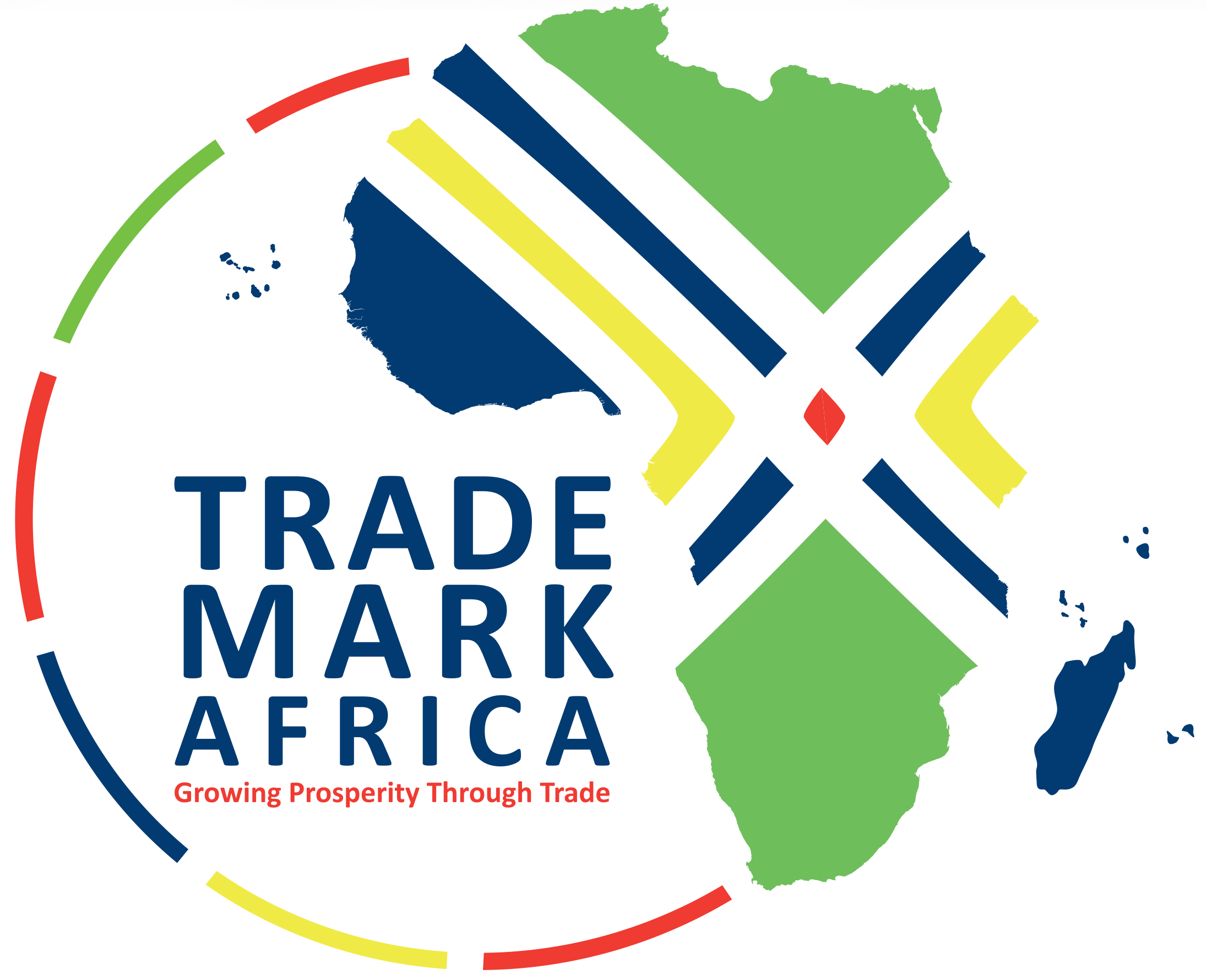
The logo combines the map of Africa with an adopted figure inside a circle, representing the unity of the continent working collectively toward prosperity, with criss-crossed lines for its trade corridors. Always reproduce it from the master artwork below.
Default. Use on white and light backgrounds.

For navy, photographic and dark backgrounds.
Keep clear space and contrast on tinted panels.
Keep a margin of empty space around the logo, with no text, graphics or edges inside it. More space is always better.
Full logo: 20 mm in print or 60 px on screen. App icon or favicon: 32 x 32 px. Below this, legibility breaks down.
Resize the whole logo diagonally as a single unit so proportions are never distorted.
Blue leads with the strongest presence; green, red and yellow balance and energise it; grey serves as a neutral secondary. Tints at 80/60/40/20% opacity extend each colour. Click any value to copy it. Don’t introduce colours outside this system.
Montserrat carries the TMA identity across the website and digital media. Used consistently, at every weight, it keeps our communications clean, legible and unmistakably ours. Sizes follow a golden-ratio scale (×1.618). Don’t use unapproved fonts.
High legibility at small sizes for the website, digital media and PowerPoint templates. Headlines at 40 pt or more, text at 32 pt or more; don’t centre body copy.
Our work is delivered with donors and implementing partners. When you acknowledge them, use the official donor logo strip and keep it intact; it is never altered.
The complete Brand Visual Identity manual covers everything on this page in depth: brand architecture, tone of voice, logo application on images, templates and social media sizes. Pair it with our current strategy for the story behind the brand.
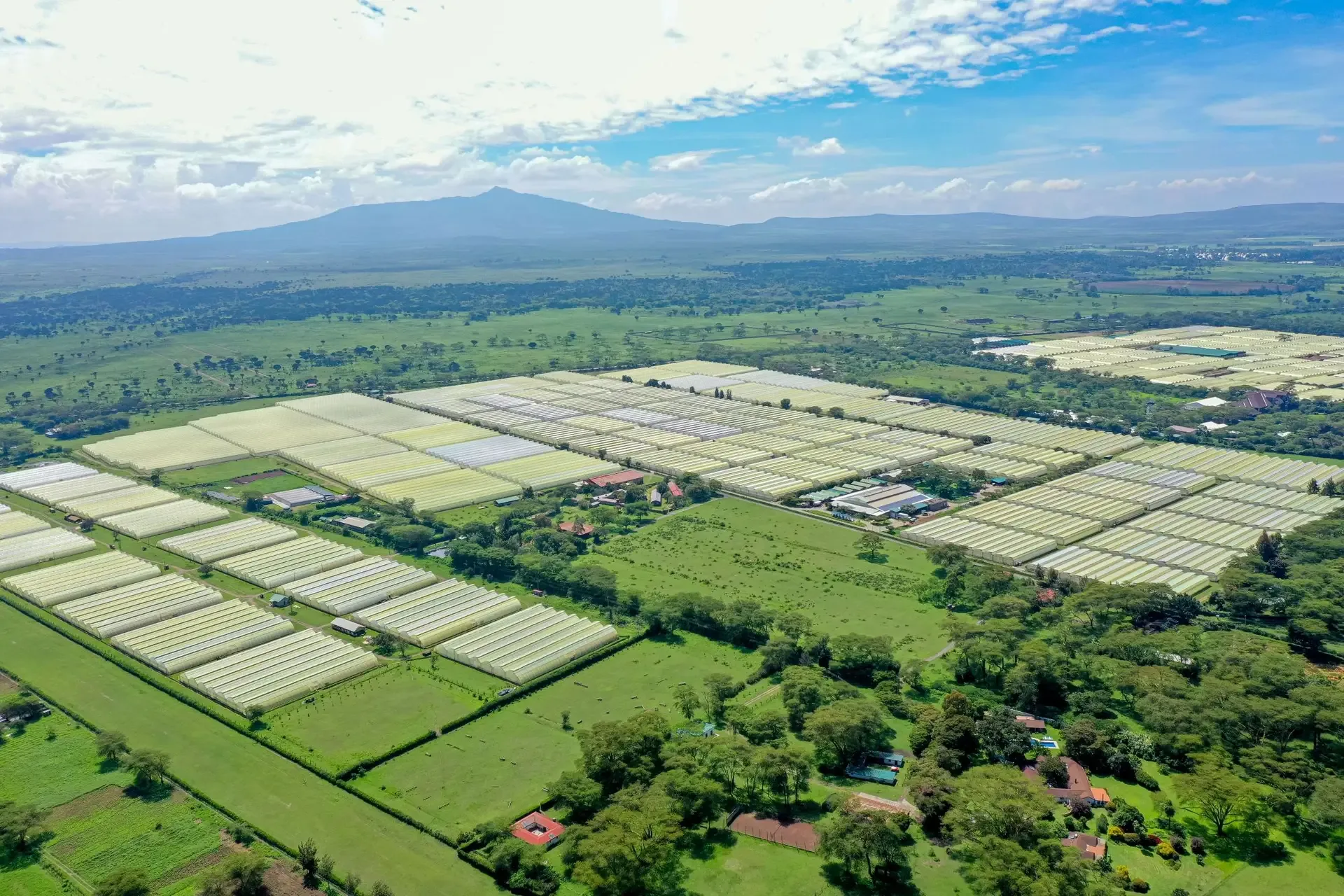
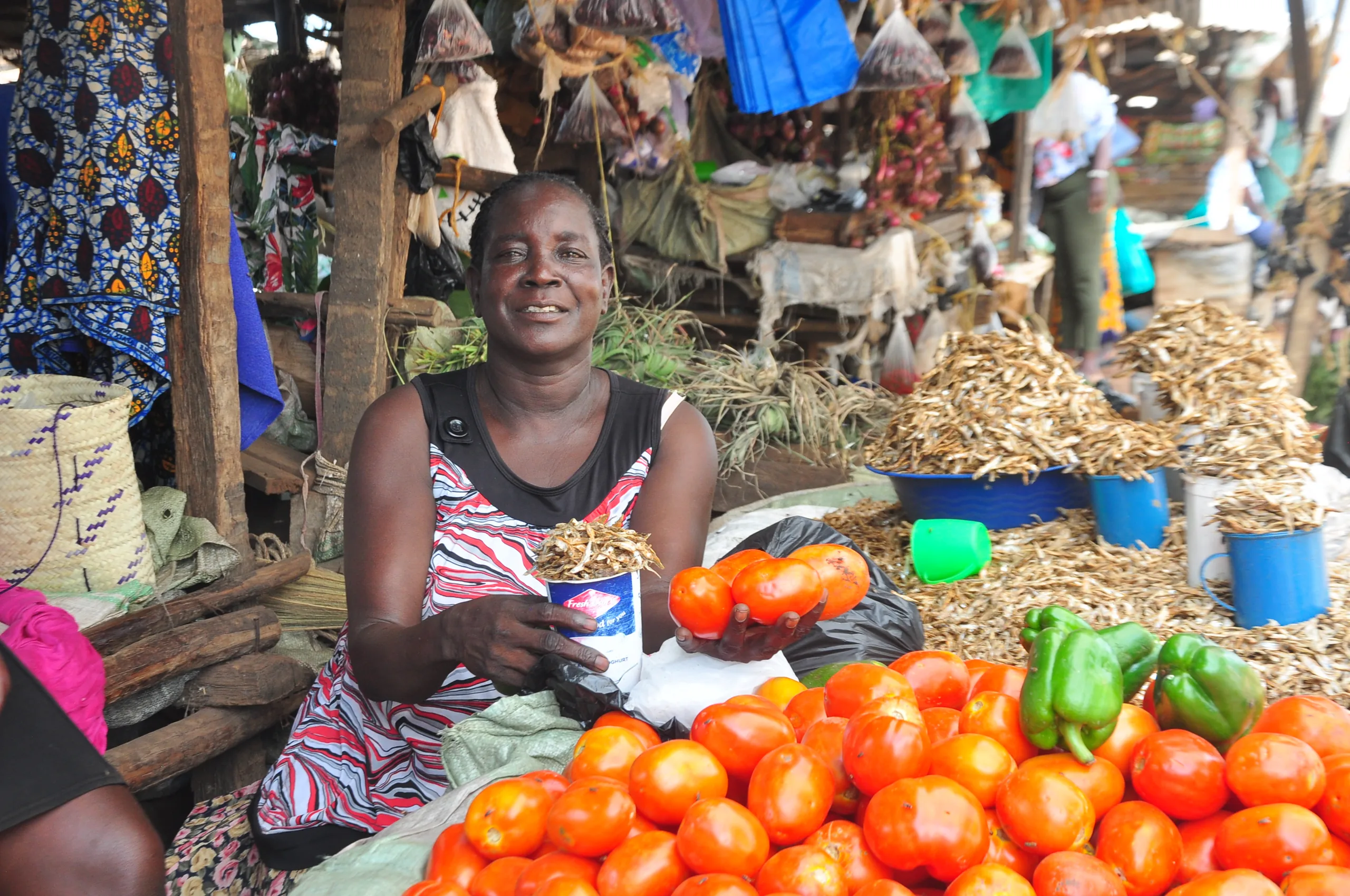
Our photography is real, human and grounded in the work: traders, borders, ports and the people behind trade. Choose bright, authentic images with clear focal points, and keep the logo in a high-contrast area with its clear space intact.


 European Union
 UK International Development
 Sweden
 Norway
 France · AFD
 Canada
 Ministry of Foreign Affairs of Denmark (Danida)
 Ministry for Foreign Affairs of Finland
 Gates Foundation
 Government of Ireland · International Development Programme
 Mastercard Foundation
 Ministry of Foreign Affairs of the Netherlands